The past becomes more complex as databases of genealogical records are shared. As a beneficiary of the churches and municipalities in Germany laboring to translate handwritten records into scannable databases, there is more to learn about the personal side of the past now than ever! It is a discovery shared by millions to have the past come alive through a new understanding of roots. As a graphic designer, my best way to understand this flood of new information is to make it visual. One chart or one map can give much more information than any other description.
There are scant graphics to represent the kinds of stories now able to be told. Places become recognized, real names jump out of the foggy past, and there are legacies handed down from one generation to the next. To illustrate these means to illuminate the meaning within the databases. My goal is to jump off of the research others have painstakingly dedicated countless hours compiling.
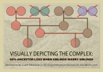
 CHARTS: The tree formation of most genealogical charts do not express the reality of village life in past centuries. By charting the more complex relationships of interfamily marriages prevalent for centuries, the numbers come alive. Evaluating dates and places, investigating the backdrop of a region’s history, comparing the activities of extended families, opens doorways to understanding change, composition, values, decisions, and even the future, within its momentum. The charting and the terminology make sense when made visual.
Unraveling a Genealogical Knot
Visual Interfamily Intermingles
Closer than Close: Charting Sibling Pairs
Visualizing Genealogical Relationships: Double Cousins
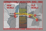
 MAPS: A growing library of original maps can be affordably customized. Pick among map styles, email me your information, and I can create for your application. From neighborhoods to cities to immigration to global migrations, so far I have illustrated Chicago, Milwaukee, states, the U.S., and Europe. I am working on a map for South America. Please enjoy these examples:
Eras of Evolution in One Neighborhood
 LOCATIONS: Requiring timeline research, each depiction is different. Drawing backwards incorporates progress and customs. Before and After illustrations make some of the best subjects. With luck, there are photographic resources, but when lacking those, the illustration then fills that gap. My favorite to create are histories that depict the same place at various point in time, showing evolution.
For blogs, portraits, articles, and research, making facts visual conveys more information than just words. Yet to offer affordably is a challenge because these works take many hours to create. But with my growing library of original maps and graphics, I can adapt them quickly to your specifications. They then can give life to your documents.
COMMITMENT TO ACCURACY:
Being authoritative is a responsibility. So my illustrations are factual. Historically correct, they can be used in articles, research, and archival portraits.
••••••••••••••••••••••••
CONTACT:
Liane Sebastian wears an editor’s hat, designer’s coat, and artist’s shoes.
BLOG: http://www.publishingpioneer.wordpress.com
PORTFOLIO: http://www.lianesebastianillustration.wordpress.com
FACEBOOK: https://www.facebook.com/liane.sebastian
LINKEDIN: www.linkedin.com/in/lianesebastian
EMAIL: lianesebastian9@gmail.com
••••••••••••••••••••••••


